The gist of the video is this: Stress releases cortisol that triggers a heart attack due to environmental stress and mental stress! This video was presented by an Indian Geriatrician, a specialist who treats older people. The video is very informative and certainly applied to dad, who at that time, we were not aware of the seriousness of the stress that he went through staying in a nursing home. Even though there were food, shelter, and maids, the stress came from his bloody room-mate who was fondling the maids and hanky-pankying around at night while dad was his room-mate trying to sleep at night. Before this joker and womanizer came, dad had the room to himself. Hence, he had complete privacy.
So, this video is shown in tribute to dad's suffering and the 5th heart attack that took his life. Moreover, dad was stubborn. When he knew he had the first sign of a heart attack, he was very reluctant to go for surgery and bypass. I am not sure if money was the root of the problem or the lack thereof. The last straw was when his youngest sister dated a married man and his wife came to complain to dad, which added to his stress and due to his aging cognitive thinking, he mistook mum to have an affair instead! Therefore, he lost all hope to live and surrender everything to God and I was the last one to see him that fateful night. He complained of chest pain even though I touch his heart slightly to pray for him. From the nurses, dad woke up at 3:00 am to request for a cup of Milo at IJN and eventually passed on early in the morning at around 5:00 am on 17th December 2018.
I was having dinner at Uncle Don's last week where the tag line states "Dine like a Don", whatever that means. A quick check-up in Google defines "a don" as "a university teacher, especially a senior member of a college at Oxford or Cambridge." Wow! What an honor! The food that we ordered was fish and chips with veggies on the side, and for me, mushroom soup with butter garlic slices, since I need to lose weight. Hence, I had a lighter dinner than the usual heavy complete meal. The ambiance was full of upbeat music with many patrons outside seated on high chairs with high tables ordering beer and alcohol.
There were many stands of congratulatory bouquets of fresh flowers sprucing up the entrance of the restaurant, newly opened in Penang Times Square, facing Dato Keramat Road. The waiters and waitresses were attentive and responsive. Perhaps "new brooms sweep clean." And I hope they maintain this good service. This place was formerly occupied by Beer Factory, but unfortunately, it could not take off. So that place was left vacant for quite sometime before the Kuala Lumpur establishment took over, by Uncle Don's - Dine like a Don!
I was in Queensbay shopping mall yesterday and took the liberty to video record the awesome decorations of an ocean theme. There was a giant inflatable oyster with a shiny pearl, even the floor has an ocean theme and such. I was there during dinner time to drink avocado mixed with pineapple juice, and 'Hokkien' beehoon. I am also trying to lose weight, and have gone down to 72kg from 80kg. I still need to lose some weight for a healthier BMI. My doctor had advised me to avoid sugars and complex sugar like carbohydrates present in rice, bread, and noodles.
As you can see from the video, the decorations filled up the entire central atrium, with giant bubbles hanging from the ceiling and sea creatures with seaweeds and algae, etc. When I recorded this splendid video and put it on my Instagram account, I was followed by QueensbayMall Instagram. Apparently, they like my video of almost the whole decoration taken from the 2nd or 3rd floor, I cannot quite recall. Anyway, enjoy my work.
Above is a video taken by me of the beauty of Gurney Plaza Chinese New Year (CNY) Decorations with neon lights, music, and the 1970s era of time. Even the floors have floor stickers of pebbles and decorations. I can feel the atmosphere of CNY coming with the festive season just around the corner. We will have a simple reunion dinner of ala carte meals each; just 4 of us since dad has gone to be with Jesus. The video speaks for itself; and if a picture is worth a thousand words, a video is worth a million words!
Above is another short video taken at Gurney Paragon when Gurmit Singh of the comedy "Phua Chu Kang" fame who was the invited host for the count down to 2020. Now Gurney Paragon is next to Gurney Plaza with 2 towers of Condominiums above. However, Gurney Plaza is more popular since it was managed by the Capital Land of Singapore. The REITs ticker name is CMMT, of which I have a few lots. At the moment, it is not doing so well but gives dividends regularly. So there, you have it, 2 videos of the high-end shopping malls in Gurney Drive, Penang.
The video was captured by me during a year-end party in Quayside Condo in 2019. The upbeat music certainly keeps us condo residents entertained with sequined dresses, ostrich feathers and more. The 70s hair was done nicely to fit into that era. The performers were pretty, slim and sexy too. Well, they did their best to entertain us with high expectations and no less. This was taken after our buffet dinner of mains, turkey, desserts, drinks, ice-cream, satay, fried 'koay teow,' etc.
Also, the dancers changed their colorful costumes belting different numbers each time they come on stage. It lasted till midnight or so, but we went back after the lucky draw prizes were announced. Some of the Caucasian residents danced to the beat and stayed up late till the end. In the meantime, enjoy my simple video shot using my iPhone X.
God made the rainbow to have seven colors from white light, which are split up into all the seven colors after a thunderstorm. I love colors and used to play around with my paper of colorful paints. MacDonalds chose the colors red and yellow so that you get excited when you see yellow and buy more food, while red makes you impatient so that you eat and quickly leave after that. Hence, there is a reason why red and yellow are now very popular colors. Companies and banks like Ambank copied or rather created the same colors for their logos. Grey and earthy colors make you look insipid, while bright colors make you stand out from the crowd.
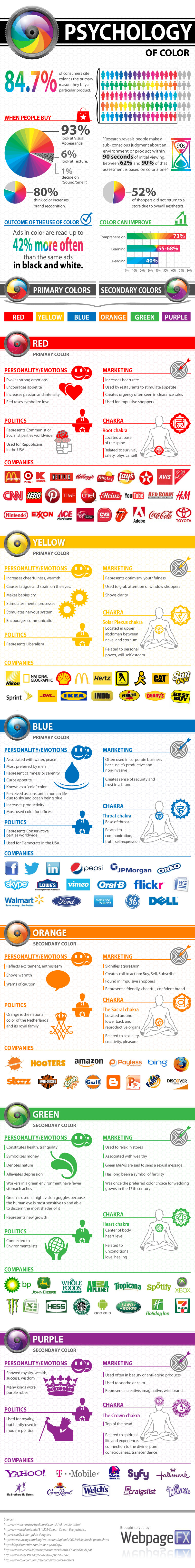
Below is a detailed infographic from webfx.com, which has come out with examples of logos of various colors accordingly. For example, Starbucks and Seven-Eleven chose green as their logo theme. For your information, you might like to know that "If Howard Schultz gave up after being turned down 242 times by banks, there would be no Starbucks." Below is a picture of Mr. Schultz.
Here is a very nice long and detailed infographic by webfx.com with the corresponding company logos sorted according to their color themes. Just check it out yourself, and this picture is worth a million words. When I saw it on Pinterest, it caught my attention, I thought this must be written as a blog post for posterity. Simply click on the infographic to enlarge to its original size to read more details below:
Above is an Instagram post on EComXFactor - The Ultimate Product Research Tool for your eCommerce Store. Just click on '>' button on the right side to swipe to the left for more pictures and information. A picture is worth a thousand words, so they say, and a video below is worth more.
So today guys, we're going to talk about how to increase your conversion rates in your Shopify or Woocommerce store. We're going to focus on improving conversion rates on your product page, so we're not going to talk about how to optimize the funnel in the checkout stage or the cart page. We're just going to focus on improving your product page, which elements you should use in order to improve your conversion and how to structure the product page correctly so you get the best conversion rates possible.
So this video is going to be all about how to increase conversion rates in your store it's going to have two parts.
The first part we're going to talk about what is conversion rate, where can you see your conversion rates? A few tips regarding how to analyze your conversion rates and I'm going to share with you 12 elements that promote conversion.
In the second video, I'm going to share with you guys the page structure that we use in our Shopify and WooCommerce stores. We've done hundreds of split tests and this is the template that is working the best for us. I'm going to show you exactly which elements we use, where do we use them and why they are converting so well.
Before we upload any product page. I'm also going to share with you a few tricks and hacks that we use, in order to understand and get a few signals regarding if our product page is going to be good or not. So stay tuned until the end. I'm sure you're going to get tons of value from this video. Okay, let's start.
Conversion rates differ between pricing points. If you're selling a product for $9.99 Your conversion rates are probably going to be higher than if you're selling a product for $29.99 or $100. When people pay more, they do more research and the conversion rates are generally speaking going to be lower. So this is the first thing to take into account.
Because people are more likely to pay and make impulse buying, of a product that they really feel is solving a crucial problem in their lives. So let's say a posture corrector, is probably going to sell better than a bone for pets. And the last thing I want to emphasize is that conversion rates differ between markets.
You need to split test everything you do on your store because if the conversion rates are improving and you didn't AB test, you can't really know what is the reason behind the improvement of the conversions. Just the fact that you assume that something would work better doesn't mean that it will work better in the actual real life.
The next thing is you must drive traffic to your website and learn the benchmarks. You can spend hours in Facebook groups and asking people what are their conversion rates and reading articles about conversion rates and stuff like that. But the most important thing is that you get to know the benchmarks of each niche and each market. What do I mean by this? As soon as you drive a lot of traffic for let's say cosmetic products in your store and you get to understand that cosmetic products, the conversion rate of cosmetic products in the US market are around 3% so from
now on, you know that every time you upload a new product in the same market and in the same niche, and if the conversion rates are lower than 3% so probably something is off with this specific product page or specific offer.
So where can we see your conversion rates? You can see them in the Shopify or WooCommerce analytics dashboard. Here's an example from one of our stores. As you can see you have here the add to cart conversion rate and sessions converted. The next place in which you can see your conversion rates are in your Google Analytics dashboard, and you guys if you haven't connected Google analytics yet, you should do so.
It's highly important. It's a really powerful tool that you can use to analyze and optimize your funnel. Here's an example from one of our stores. As you can see, I created a breakdown between desktop and mobile users. And this is very, very important because this way you can see two things. First of all, you can understand that if your performance in desktop is better, so you might as well consider targeting and creating ad sets that are desktop specific and not using only auto-placement and driving traffic only to your desktop website.
Let's cover now the majority of the elements that you can use in order to promote conversion. So the first one is scarcity. Highlighting items that are low in stock and making people, letting people know that the stock is running out. Here's a quick example from Amazon. Even Amazon uses these kinds of tricks. As you can see only two left in stock. This is a thing that obviously can promote conversion.
The next thing is creating a sense of urgency. Using countdown timers on your website, telling people that the limited-time promotion is ending by the end of the day or ending by the end of the weekend or ending before Christmas or whatever. Here's a quick example from Best Buys' website, as you can see here, they have a countdown timer, which is ending by the end of the day. The next thing is exit-intent popup.
This is not used so often in mobile versions because the popups don't look so well in mobile, but this is something that many websites do use in their desktop versions. Just let me show you guys an example. This is the Cinderella solution, one of the best offers running in the Clickbank affiliate network these days. I'm here watching the video and as soon as I go to the 'back button' I get this, this is the exit-intent popup.
Normally the website is going to try for the last time to convert you and make you change your mind instead of having. So as you can see here, they're telling me 'hold on, don't leave this page'. They might even offer me a promotion - 20% off or even ask me to enter my email and then they can re-market and send emails and try to convert me via email before I leave the website.
Okay. The next thing is having a lot of call to action buttons. You want to make the purchasing process as frictionless as possible for the buyer. So this means you have to have a lot of buttons, not too many, cause you don't want to confuse them, but you have to let them the possibility to start the checkout whenever they want.
So let me show you a quick example from what Russell Brunson, the founder of ClickFunnels is doing on his website.
So you see here that the call to action is 'yes, I want my free copy of the dotcom secrets'. Then you scroll down and suddenly You see another button 'ship my free copy. Now I'm ready to get started'... 'ship my free copy now, I'm ready to get started', 'Ship my free copy of dotcom secrets now,'
The next thing is having social proof and testimonials. So I divide this into two. Testimonials is the first thing you must have customer reviews on your website and if you have images of customers using your product and benefiting from the main benefit of the product, obviously this is awesome. Also having video testimonials is something that can really promote the sale.
And the other thing is having social proof in a way that lets the people understand, let the customers understand that they are not alone on the website. People know this website that it's not a shady website and this isn't a
scam. So let's go back to the example of Clickfunnels, As you can see here, you have many different videos and testimonials of customers.
I'll show you another example from the Inspire Uplift website. So they have a lot of testimonials of customers. Obviously, in my opinion, it's better to have testimonials that are detailed and really emphasize and elaborate on the use of the product, how the customer, the potential customer can benefit from using it. And on the other hand,
this is a small social proof trick that an Inspire uplift is using. They took this widget and placed it under
the add to cart section.
And this basically whenever I entered the website and I see that I and the friends of mine have liked the Facebook page of this website, this gives me the understanding and the feeling that more people know this website and it's not a scammy website. The next element is product badging. So just using a small ribbon or even text saying that one product or one bundle or one type of product is the most popular or the best value or most recommended or anything like that can really improve the conversion rates and can make people choose this offer over another.
We tested something similar with a product of ours, and we just wrote next to one of the choices, which wasn't the cheapest one, We wrote 'most popular,' and people started buying this option more just because we wrote 'most popular,' we did an AB test, and we saw that the use of just writing 'most popular' has increased the conversion rate and increased the number of people who bought that specific option.
And this was amazing and something crazy that you should keep in mind as well. So product badging is highly essential. Another thing I'm going to talk about upsells and cross-selling. Cross-selling is selling a complementary product to your customers and showing them related products that can also help them. You guys probably know this from Amazon which uses it a lot. 'frequently bought together' and then they are offering you to buy a specific bundle,... customers who viewed this also viewed this and they give you ideas. It also makes you feel that this website is more legit and also might improve your AOV because if people, buy for example one thing and they think that even the other product can complement and help them solve their problems. So they might buy that product as well, and this will increase your AOV.
That's it for the first part of the video. Check out the second part of the video in which I'm going to share with you the page structure that we use for all of our product pages in our Shopify and WooCommerce stores. And I'm also going to share with you a checklist that you can use before you upload any product and launch a Facebook and Google ads.